ILLUSTRATION AND VISUAL NARRATIVE // TASK 2
6.5.2022 - 20.5.2022 (Week 6 - Week 8)
Ang Shin Er / 0355231
Bachelor Of Design (Hons) In Creative Media / Taylor's University
ILLUSTRATION AND VISUAL NARRATIVE // Task 2:
Decisive Moment
_

LECTURES
.png)
.png)
.png)
.png)
.png)
.png)
.png)
.png)
.png)
1.png)
.png)
WEEK 6 - COMPOSITION THEORY 2: PERSPECTIVE
The art of representing three-dimensional objects on a two-dimensional surface so as to give the right impression of their height, width, depth, and position in relation to each other
.png)
CONSTRUCT PERSPECTIVES :
.png)
| ONE-POINT PERSPECTIVE
The most simple method of producing three-dimensional images entails drawing your objects emerging from a single point on the horizon. As images get closer to the vanishing point the smaller they become, until they become so small they actually vanish completely
.png)
Here a single vanishing point establishes the guidelines. All objects recede toward this one point.
.png)
There are vanishing points on either side of the horizon, and the objects and buildings within the scene are drawn to both of these vanishing points. This can help create a greater sense of space in a scene and helps give objects more of a sense of dimension and place.
| TWO-POINT PERSPECTIVE
.png)
Place two vanishing points on the horizon and establish two sets of overlapping perspective lines fanning out from them. This network of lines allows objects to recede toward two separate points, allowing more dynamic views than that one point alone.
.png)
| TWO-POINT PERSPECTIVE
Usually consists of two vanishing points on opposite sides of a horizon (as in a two-point perspective), but with the addition of another vanishing point high above or below the horizon. This is most useful to achieve a sense of drama and scale or to show more objects in a single scene.
.png)
If the vanishing point (which is not connected to the horizon) is a great distance from the horizon, the intensity of the angle will be less than if it were placed close to the horizon (which creates a more extreme viewing angle).
.png)
A third vanishing point on the vertical axis gives you a far broader range of angles, and really allows your viewers to “look down” into your city.
.png)
Fig 1.8 - Three-Point Perspective (6/5/2022)
| ISOMETRIC VIEW
1.png)
For creating detailed concepts of individual buildings, it’s more beneficial to use a simple isometric view, since it allows you to clearly present three sides of your design without distorting perspective or obscuring details
| DYNAMIC APPLICATION
.png)
While perspective is extremely useful and can be applied to almost any illustration or scene, it doesn’t need to be rigid or boring, and you don’t need to adhere to the perspective method in a strict way. For the example try mixing different perspective methods as visualized by the crashing spaceship and the ground below.
_
INSTRUCTION:
TASK 2
| EXERCISE 2: DECISIVE MOMENT
For task 2, we can use any published media like movies, animation, books,
comics, or manga. we have to capture the unique, fleeting, and meaningful
moment of that time, ideally involving movement and action. We will also
need to create a background that interacts visually and psychologically
with the subject in a synergistically meaningful figure/ground
relationship and describe the moments.
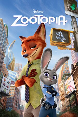
F.g.1.1 Movie ZOOTOPIA
After some consideration, I decided to choose one of the Disney
movies which is ZOOTOPIA (2016). I chose my favourite scene in the entire movie where Nick Wilde(the fox)'s graduation ceremony is held after Nick completes his training at the Zootopia Police Academy.
Onstage, Judy Hopps (the rabbit), now an accomplished officer, gives an inspirational
speech about her realization of the complexities of life in the city and
she introduces Nick Wilde as the first fox police officer in Zootopia.
Nick walks onstage and Judy presents him with his badge and pins it onto his uniform, then they salute together.
First, I look at the video to see which frames were the most emblematic
moments in this scene. Then, I decided to choose the salute part
where Judy badges Nick herself on his uniform, then they salute together. There were about 45 frames in total in this scene, but I removed some
frames and left Nick's salute back to Judy to make it simple.

F.g.1.2 the screenshots of the scene
Here is my first rough sketch :

F.g.1.3 my rough sketch
After removing the other scene and leaving Nick's salute back to Judy, I simplify from 45 frames to 15 frames. I had removed all the background and it was easier for me to do the
design.

F.g.1.4 Nick in PNG
Then, I import all the files to Adobe photoshop to do my first gif, here
is my first try to do the GIF:


F.g.1.4 my first try to do Gif in Adobe photoshop

My first try to do Gif
Next, I will proceed to design the background in Adobe
illustrator.

F.g.1.5 creating shadow to all the
Nicks


F.g.1.6 creating title

F.g.1.7 Designing Poster in Adobe illustrator

F.g.1.8 my final version of the poster

F.g.1.9 import image to photoshop
All images were imported into Photoshop in different layers
and finalised it to make them smooth. Animations were created from
the timeline.

F.g.1.10 checking all the detail in photoshop

F.g.1.11 my final outcome of my animated poster
My first time Submission :
Final poster in .jpg [900 x 720 pix]
Final animated gif [900 x 720 pix]
Documentation of artwork progress
My final Submission :

Final poster in .jpg [900 x 720 pix]

Final animated gif [900 x 720 pix]
Documentation of artwork progress
_


Comments
Post a Comment